The charts below show the average percentages in typical meals of three types of nutrients, all of which may be unhealthy if eaten too much.
Summarise the information by selecting and reporting the main features, and make comparisons where relevant.
SAMPLE ANSWER-
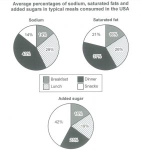
The charts compare the mean proportion of harmful nutrients, which consists of sodium, saturated fat and added sugar, consumed in four regular meals in the USA.
The breakfast consumed by the people of USA is much healthier as it provides the minimum percentage of three variety of nutrients, with just 14% of sodium and 16% each of saturated fat and added sugar. It is followed by lunch, which is the second healthiest meal in the diet of an American individual. There is 29% of sodium intake, 26% of saturated fat and 19% of added sugar intake.
The quantities of sodium and saturated fat consumed are highest during dinner time (43% and 37% respectively). Whereas, the percentage of added sugar intake in an American’s diet is comparatively large, which is 42%.
Overall, snacks and dinner are unhealthy meals. Lunch is less healthy than breakfast, but it is still healthier than snacks and dinner.
The graph shows how much sodium, saturated fat and added sugars were consumed in the average meal in the United States. Looking from an overall perspective, it is readily apparent that the majority of sodium and fat were consumed at dinner, while most sugar was eaten in snacks. Lunch also tended to be salty and have a lot of fat while breakfast had the lowest percentages for all three nutrients.
Dinner and lunch had roughly similar, large proportions for both sodium (43% for dinner and 29% for lunch) and saturated fat (37% for dinner and 26% for lunch). The amount of sugar in an average meal for dinner and lunch was much lower at 23% and 19%, respectively.
Turning to breakfast and lunch, which also had comparable percentages, they were both made up of 14% sodium. For saturated fats, snacks contained 21% and breakfast was slightly lower at 16%. In terms of sugar, there was the greatest disparity with 42% of snacks being sugary and just 18% of breakfasts being made up of sugar.
IELTS Examiner Sample Answer Analysis
1. The graph shows how much sodium, saturated fat, and added sugars were consumed in the average meal in the United States. 2. Looking from an overall perspective, it is readily apparent that the majority of sodium and fat were consumed at dinner, while most sugar was eaten in snacks. 3. Lunch also tended to be salty and have a lot of fat while breakfast had the lowest percentages for all three nutrients.
1. The first sentence of the essay should just paraphrase the topic – don’t waste too much time on this sentence.
2-3. Next is the most most important sentence of your essay – your general overview. For this type of graph just make a comparison of ALL the different areas.
1. Dinner and lunch had roughly similar, large proportions for both sodium (43% for dinner and 29% for lunch) and saturated fat (37% for dinner and 26% for lunch). 2. The amount of sugar in an average meal for dinner and lunch was much lower at 23% and 19%, respectively.
1. The first sentence contains the meals I will talk about. I chose to focus on lunch and dinner first and then in the next paragraph breakfast and snacks because they have more similar numbers. It would have been harder to write about the ingredients instead of the meals. But it is possible! Just make sure you have some kind of a logical structure for your paragraphs!
2. The second sentence finishes givin the data. Always include the data or you will get band 5 for task achievement!
1. Turning to breakfast and lunch, which also had comparable percentages, they were both made up of 14% sodium. 2. For saturated fats, snacks contained 21% and breakfast was slightly lower at 16%. 3. In terms of sugar, there was the greatest disparity with 42% of snacks being sugary and just 18% of breakfasts being made up of sugar.
1. The first sentence focuses on the other meals, gives my reason for focusing on them and describes the data.
2. My next sentence continues to describe and compare the data for lunch and snacks.
3. My final sentence finishes the data. You don’t need a conclusion! You can include one if you feel that your overview needs a bit more detail though…
Sample Answer Vocabulary
Try to figure out what the words in bold mean from the sentences. Write down your guesses and then check your answers below.
The graph shows how much sodium, saturated fat and added sugars were consumed in the average meal in the United States. Looking from an overall perspective, it is readily apparent that the majority of sodium and fat were consumed at dinner, while most sugar was eaten in snacks. Lunch also tended to be salty and have a lot of fat while breakfast had the lowest percentages for all three nutrients.
Dinner and lunch had roughly similar, large proportions for both sodium (43% for dinner and 29% for lunch) and saturated fat (37% for dinner and 26% for lunch). The amount of sugar in an average meal for dinner and lunch was much lower at 23% and 19%, respectively.
Turning to breakfast and lunch, which also had comparable percentages, they were both made up of 14% sodium. For saturated fats, snacks contained 21% and breakfast was slightly lower at 16%. In terms of sugar, there was the greatest disparity with 42% of snacks being sugary and just 18% of breakfasts being made up of sugar.
Answers:
consumed: eaten
average meal: the amount that people normally eat
readily apparent: very clear
majority: most of
tended to be: usually did
nutrients: the compounds that make up foods
roughly similar: not that different
respectively: in turn/for each category
turning to: looking at the next area
comparable: similiar
made up of: composed/consisting of
slightly lower: a little bit less
greatest disparity: biggest difference
sugary: full of sugar/sweet


0 Comments